
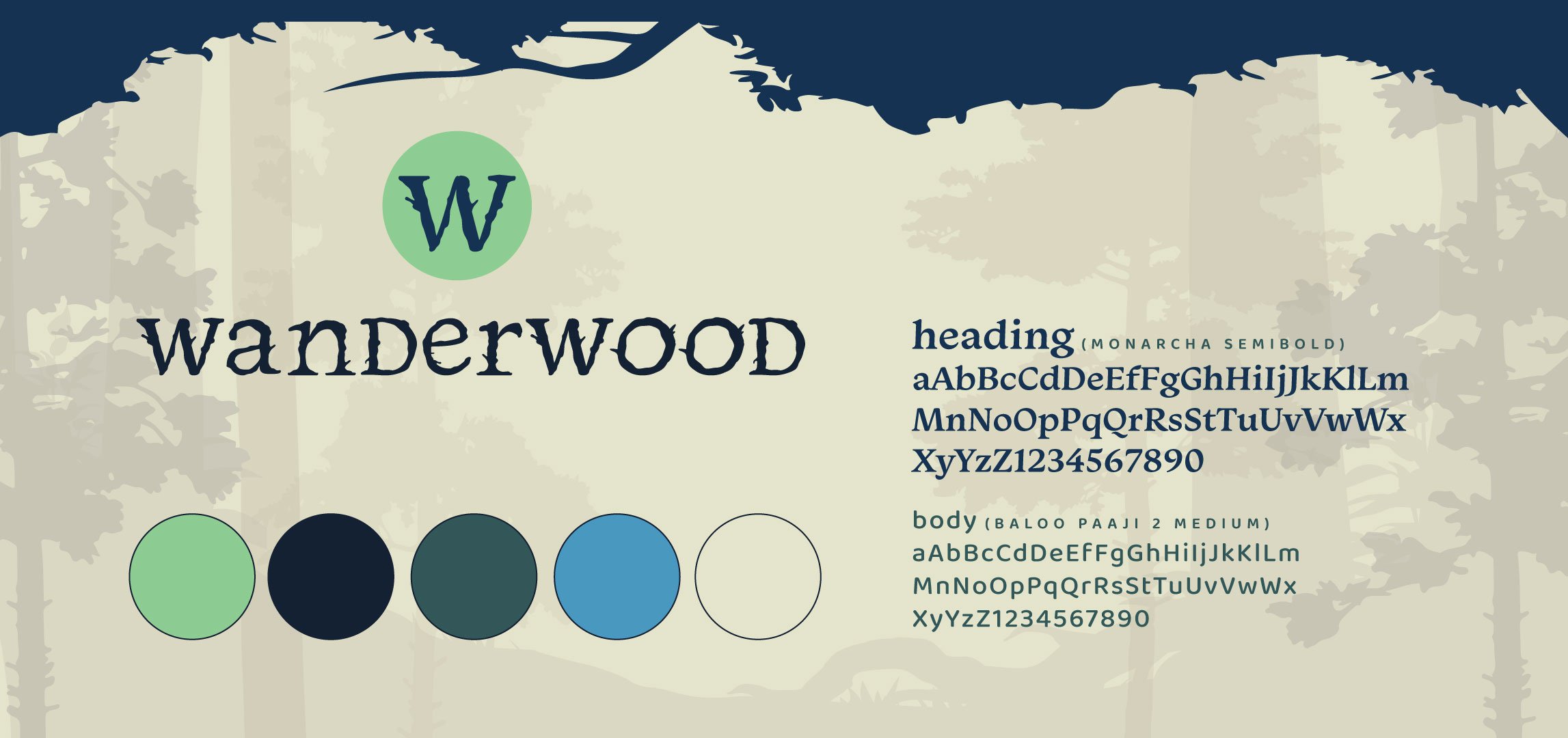
Wanderwood
A music festival made to escape the realities of everyday life, Wanderwood becomes a haven of music and joy. When imagining music festivals and other concerts, there is an immense party-culture that follows in the same community. Rave and drug culture follow music festivals, and Wanderwood is meant to bring a sense of relaxation and enjoyment as a contrast to those other festival types. Taking place at the same location as Firefly Music Festival, Dover Downs and the surrounding wooded area becomes home to a weekend long musical retreat into the woods.
Instructor: Soonduk Krebs
Institution: Tyler School of Art and Architecture - Temple University
c. 2023
DIGITAL MARKETING
BRANDING
UI & UX

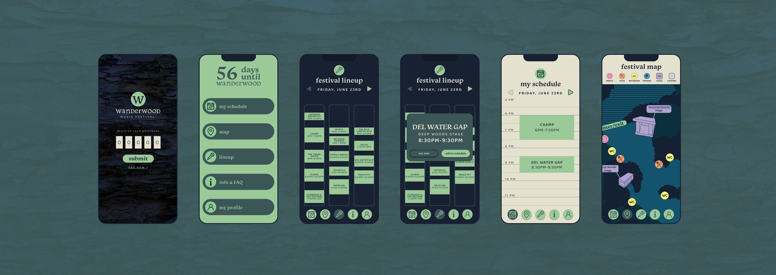
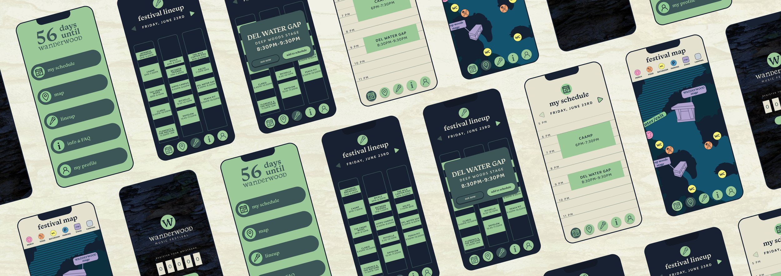
festival app
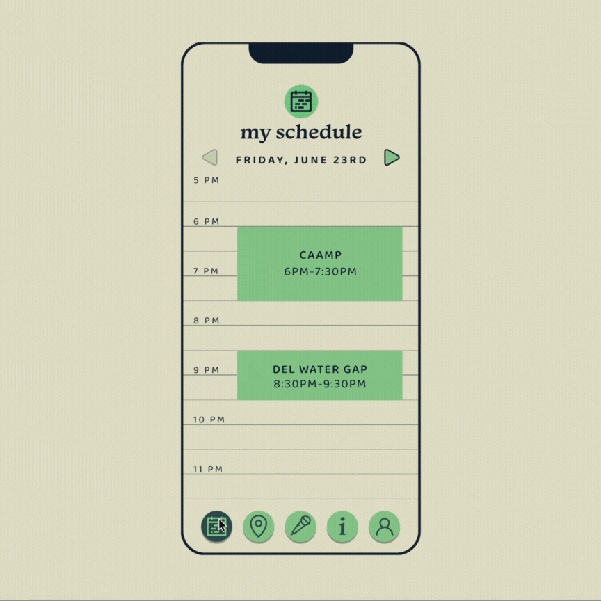
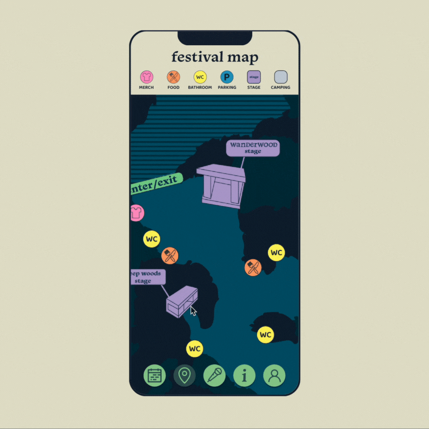
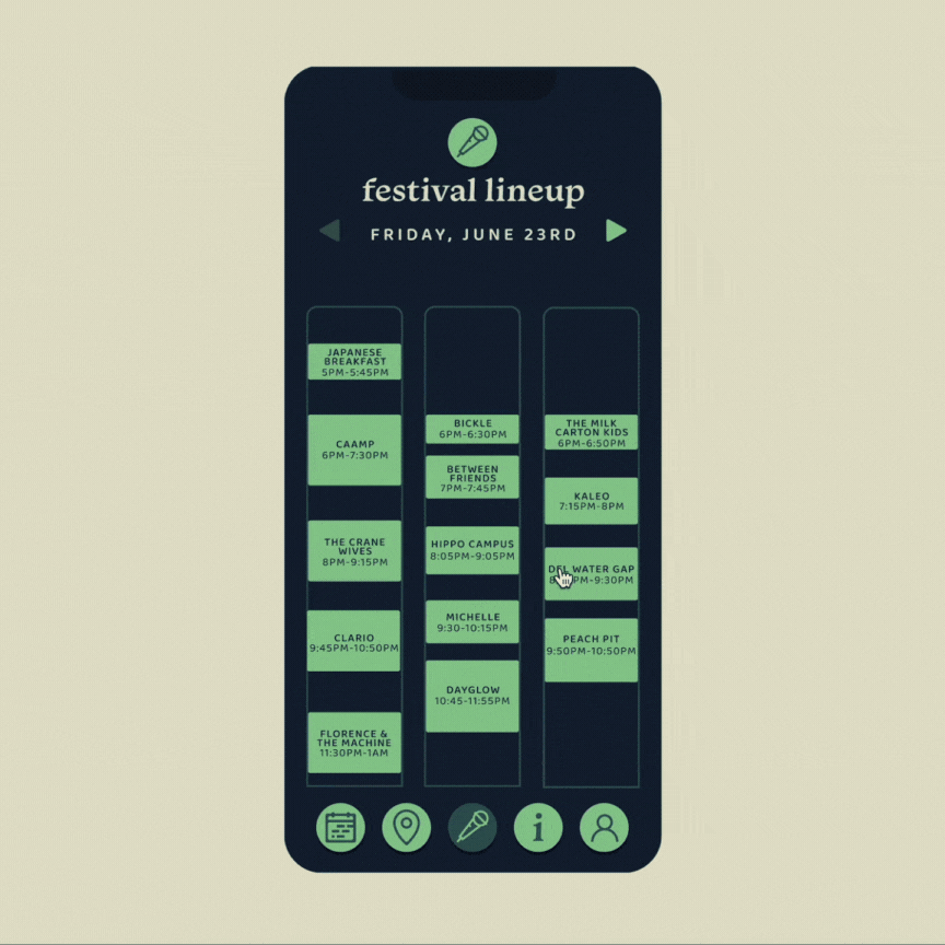
Apps and platforms can make an experience that much easier for the attendee. In the case of the Wanderwood app, the abilities of this platform is extremely helpful. With the ability to register your wristband, plan your festival schedule, and find your way around the festival, what else could be needed? It covers the necessary bases to ensure that festival-goers have the easiest experience pre-festival, during the festival, and post festival. The user-flow walks through the registration of the wristband, organizing and viewing your preferred schedule, and then browsing the map to see stage locations. The app is clean with limited buttons and clean color palette to help with understanding.
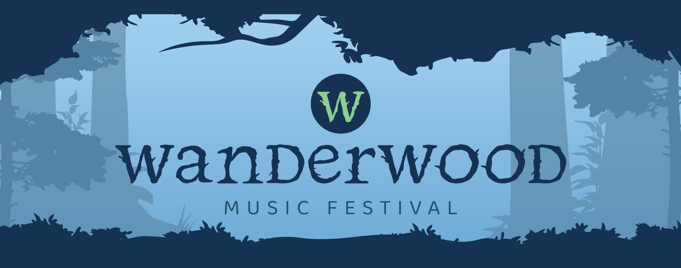
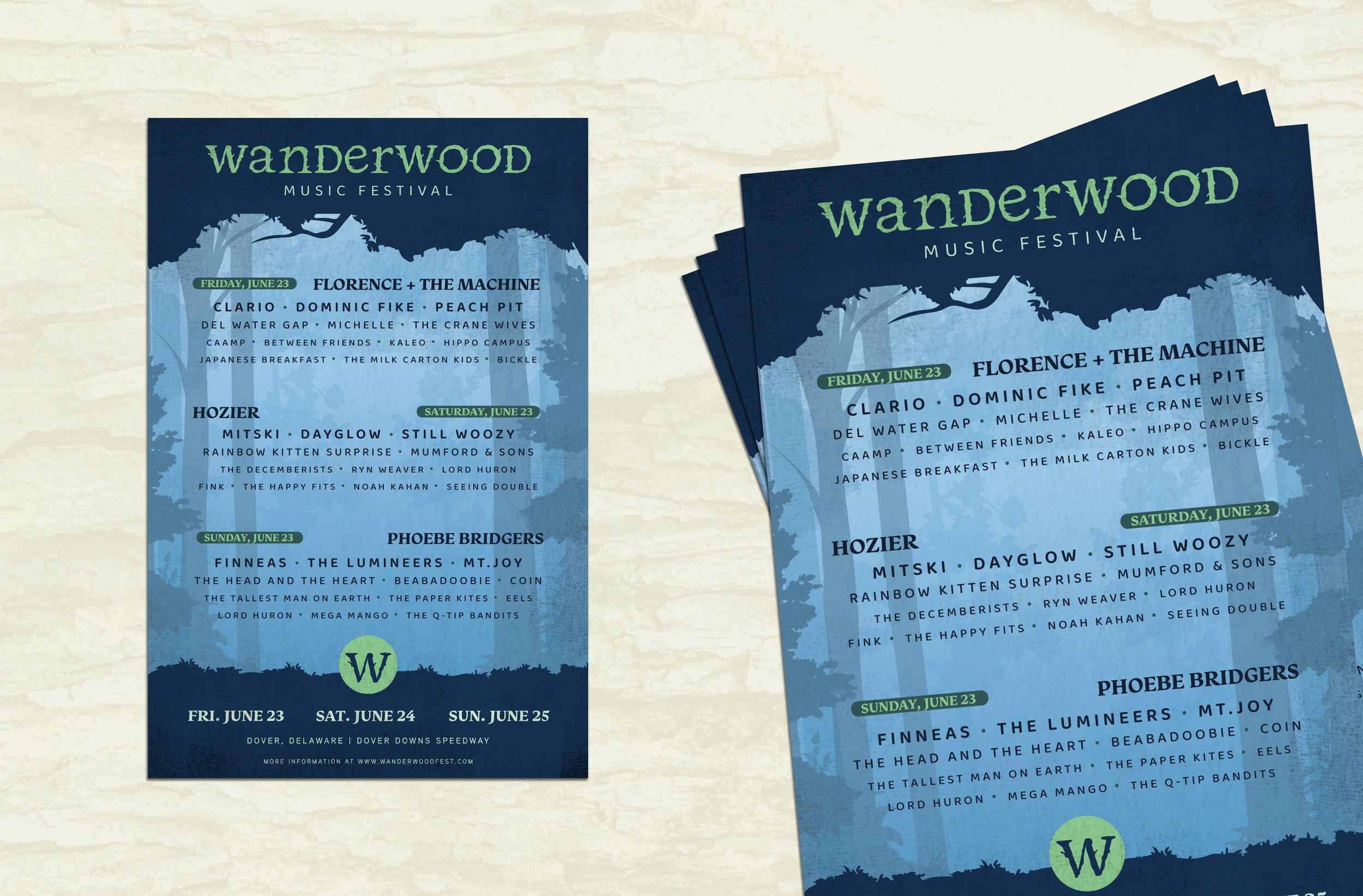
Branding
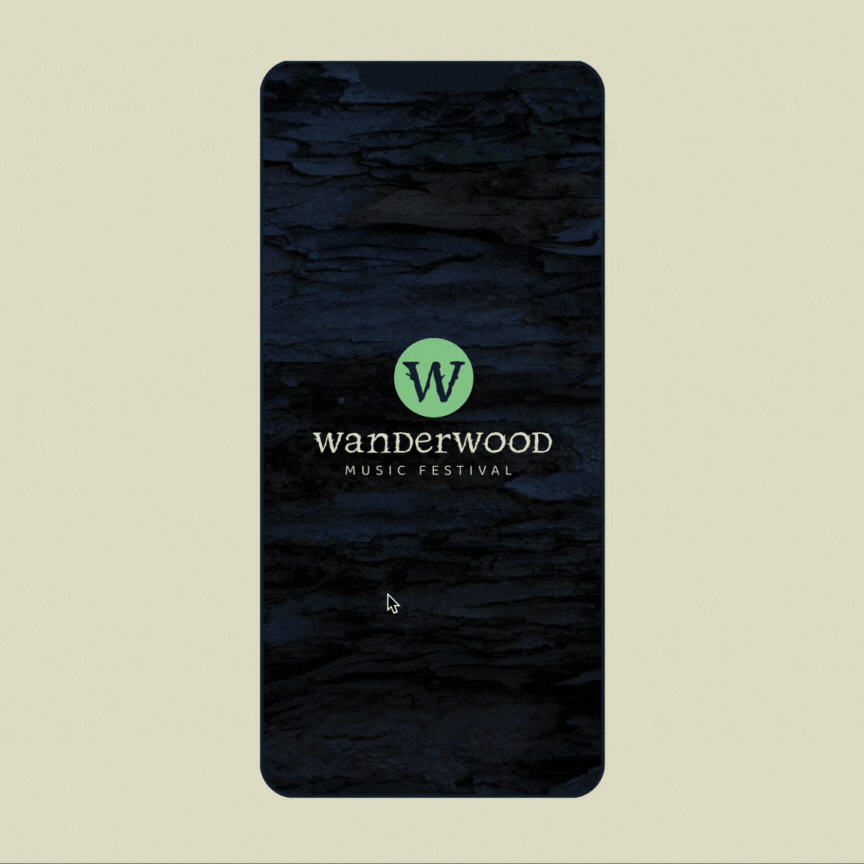
When deciding on the branding, there was a lot of exploration on other festivals and what their identity consisted of. Most festivals would have a type-based logo that would be paired with an icon or another recognizable image. With his idea in mind, I created the “W” logo mark that is paired with the stylized “Wanderwood” type for an effective type-based identity. The colors are utilizing cool and neutral cold tones of colors to convey a sense of mystery and wonder in the festival. There is a relaxed feel about these colors when combined together it allows the viewer to feel the sense of calm I wanted to convey.

way-finding
The map became an important element to create to ensure the attendee knows where the stages and necessities are located in the festival grounds. By using contrasting colors, the map stands out against other branding materials. These colors are meant to only be used for way-finding purposes. On the signage found at the festival, the icon on the map key is repeated, allowing there to be a correlation between the two for the attendee to understand clearly.


wristbands
The wristbands designed for the festival are meant to be easily understood by the attendees as well as security and staff. The 3 tiers of passes are 1-day, General Admission, and VIP types. Each had its own meaning for the festival weekend. The single day pass is seen in all dark navy to differentiate from he other passes. For those with 1 day passes, they shouldn't be able to camp in the full weekend camping section, and this can be prevented by seeing an attendee wearing this band in the camping space. For the VIP band, it is all green in a way to set it apart from the other two blue-based passes. The green is very different from the others, making it easy to spot when someone is out-of-place in the VIP section.


social media
Instagram and social media becomes extremely important when it comes to large scale events and promotion. Currently, social media is the easiest way to gain insight and exposure about an event, so the feed on social media must be tactical and thought out. By utilizing colored photo treatments, photography is used to showcase the energy of the Wanderwood festival as well as the headlining artists. A announcement posts and a lineup poster can also be seen to be featured on the Instagram grid to help break up the photography with some type-driven posts.
