

Hound
When students are looking for a way to navigate campus, how does one do so at Temple University? Well, 54% of surveyed students discuss the problem of navigational resources needing to be improved as the existing navigation system is hard to understand and work with. With this data, the focus of campus navigation became the project’s priority to solve the problem. In addition, creating a more user-friendly app and a place to study and find classes, restaurants, and others allows users unrestricted freedom as they navigate campus.
Sierra Henderson and I took this project by the reigns and attempted the break up the work to ensure it got done constructively. I scoured the web for research and UX for the wayfinding app. The focus of my efforts was spent building and prototyping the app types. Sierra focused on the design system, logo design, and compiling of information.
Instructor: Courtney Spencer
Collaborators: Sierra Henderson
Institution: Tyler School of Art & Architecture - Temple University
c. 2022
UX AND UI DESIGN
DESIGN SYSTEM
RESEARCH
PROTOTYPING


Research
When beginning research for Hound, we wanted to establish a problem and the pain points surrounding navigation and campus life. By doing some initial research and exercises, we were able to confirm that narrowing in on wayfinding on campus would be a significant enough challenge to tackle on its own for the app.
Survey
We conducted a survey asking 33 students about campus life and their feelings on existing campus navigation. The first question students were asked was, “In the first week of classes, were you late to any of them due to navigational issues? How late were you to class?” and 33.3% of students responded they had never been late. However, 67% of those students stated, they had been a couple of minutes late due to navigation issues.
Students were then asked if they used campus maps, GPS, or other navigational resources to find their classes, and 67.4% of students responded that they used GPS. 0.12% of students stated they used a combination of GPS and campus maps — while the other 0.12% used campus maps strictly. Students were finally asked on a scale of 1–5, 1 being difficult and five being easy, is it navigating the TU Mobile Map, and 42.4% responded neutrally. In comparison, 24.2% answered that navigating the TU Mobile Map was easy.
Value Proposition
Accessible: The kiosk and app will be accessible to all students, staff, and visitors. There will be multiple kiosks set up in different buildings throughout Temple University campus where users can go on to navigate their classes. Through the kiosk, users could have the option to either exit the screen after they are done or continue on the mobile app.
Reduces Time: With the app and kiosk being easily accessible for students on campus, this will also reduce the time it takes a student to search for their classes.

Design Process
After doing thorough research on navigation apps and Temple’s own campus and student feedback, we wanted to take a very intentional way to design for each university and its branding. By having an active color shift in different universities, it posed a challenge to make it easiest to understand with the interface existing in multiple color variations. Therefore, we focused the color change on buttons and selected icons in the navigation.
Digital Assets
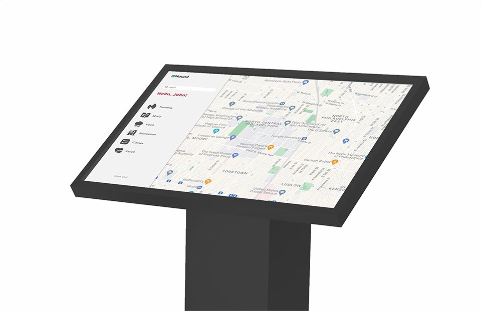
When creating the digital components of the Hound navigation, we considered the ease of use as well as what the general demographic of users would be using. As a result, we decided creating a mobile app format as well as a touch-screen kiosk format would be appropriate and ideal for the user.
The app utilizes a familiar navigation interface. We maintained this to ensure the user could approach the app easily. The bottom navigation structure allows the user to tap between different tabs. By adding micro-animations and overlay features within Hound, we said a friendly sense to the application. Not only will the app house information for navigating to classes, but it will also include trending places for studying, food, and recreation around campus. The user can also save their favorite spots on campus in the saved section. This allows there to be a level of personalization to each user’s experience. Besides the traditional navigation style, the app enables AI technology to navigate within buildings to find specific internal locations.
The kiosk format can be worked independently as well as in combination with the mobile app. The kiosk would allow users to tap their ID to log in to the tablet to view their classes and saved locations. After viewing the route to the desired location, the kiosk gives you the option to scan a QR code to continue on the mobile format so you can get active directions as opposed to the static map.

Design System and Brand Assets
Naming: Hound is a company that aims to make navigation easier for students on Temple University’s campus. We wanted the name to represent wayfinding, so that is how we came up with Hound. Houd is named after the famous hound dog known to sniff out locations and objects.
Logo Design: During the sketch process, we were trying to develop a simple but unique logo that didn’t play off the “hound dog” or navigation system. We wanted something more discrete while being able to recognize the logo mark. So, we came up with a simple line shape made up of the letter “H” to display a route and the name Hound.
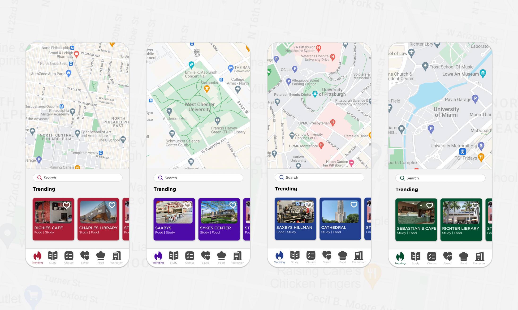
Color Variation: Houd’s primary color is green and black. Since this navigation app will be universal for all campuses, we will be swapping out our brand colors for other university colors. We focused on West Chester University, the University of Pittsburgh, and the University of Miami when showcasing how these colors could be personalized based on the school.
Design System: For the design system, we added color variations of the different schools, typography, iconography, buttons, effects, controls, micro animations, and the grid layout. Each one displays the whole system for the app and kiosk for universities to go into and change as needed.
Conclusion
Hound’s goal is to make navigation around campus more accessible and more manageable throughout all college campuses. The flexible branding and minor adjustments can be applied to any campus. While maintaining a familiar UI to other navigation apps, we accomplished a simple, friendly, and helpful application that has the potential to grow into a larger project overall.